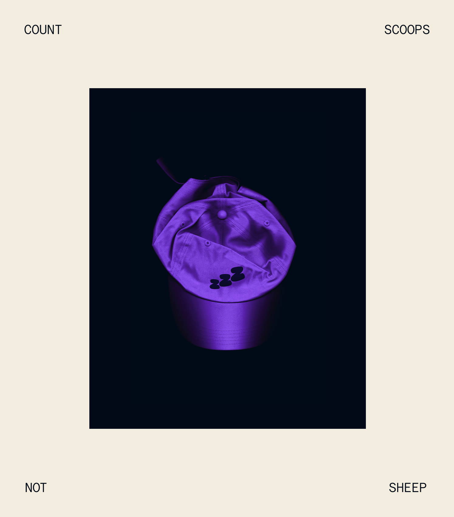
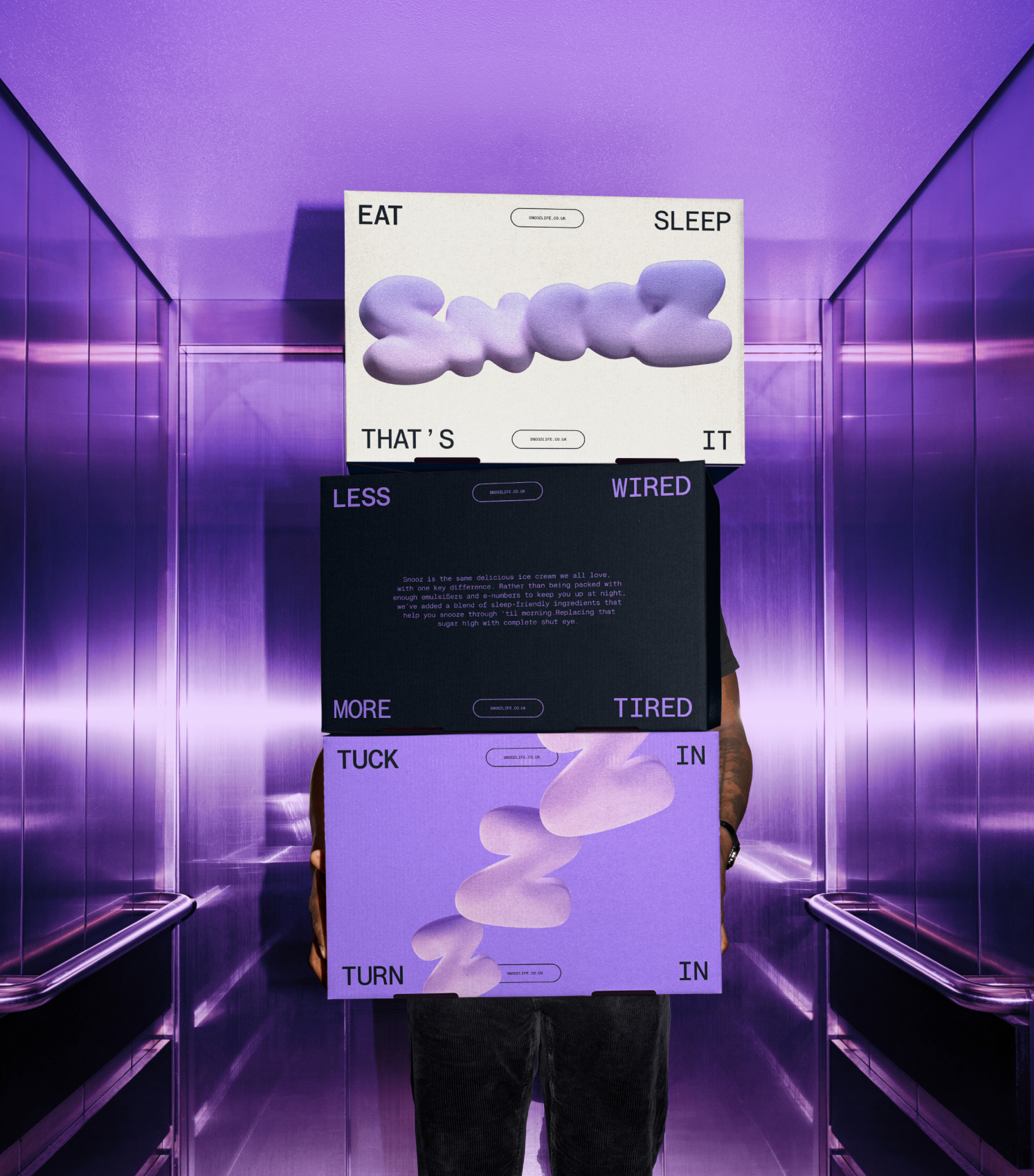
SNOOZ is THE WORLD'S DREAMIEST ICE CREAM. While the cold treat usually keeps us up with an eye-opening mix of emulsifiers and e-numbers, Snooz' sleep-friendly blend tucks you in and turns out the lights. Subverting summery, sickly sweet codes with a maturer idea and ID that says night and night-night in one.

Studio: HOW&HOW Role: WRITING Industry: FMCG
THE SWEET TO HELP YOU SLEEP
Think of ice cream and your mind goes straight to a hot summer’s day, and that all-too-familiar jingle coming round the corner. Category convention packaging would suggest the same too, with enough bunting and seascapes to make a Pimm's cup blush.
But for an ice cream concocted for the night not daylight, we couldn't just roll out the same old, same cold. We had to rip up the gingham carpet, flipping ice cream on its head with an identity that operated after nightfall. Call it a watershed moment, if you will.
THE IDEA BEHIND SNOOZ
COOLER THAN THE COLD
SIDE OF THE PILLOW
Ice cream's a bit naughty, yet everything the industry churns out is sickeningly sweet. The aim for Snooz is to be the adult in the freezer aisle, with a voice that feels more at home snuggled on the sofa than shared over dinner. Every word is playful, suggestive and, dare we say, spoon-in-cheek, making for language that's chill enough to get you hot under the collar.
SNOOZ' NSFW (NOT SUITABLE FOR WORK) VOICE
YOU SNOOZ
YOU SNOOZ
"Working with the team was an absolute joy—they brought creativity, energy, and a real sense of fun to the project. They understood how to subvert the playful codes of ice cream and create something cooler, calmer, and entirely memorable.
The result is a brand that feels dreamy, fun and absolutely delicious."
RECOGNITION
METEORIC™